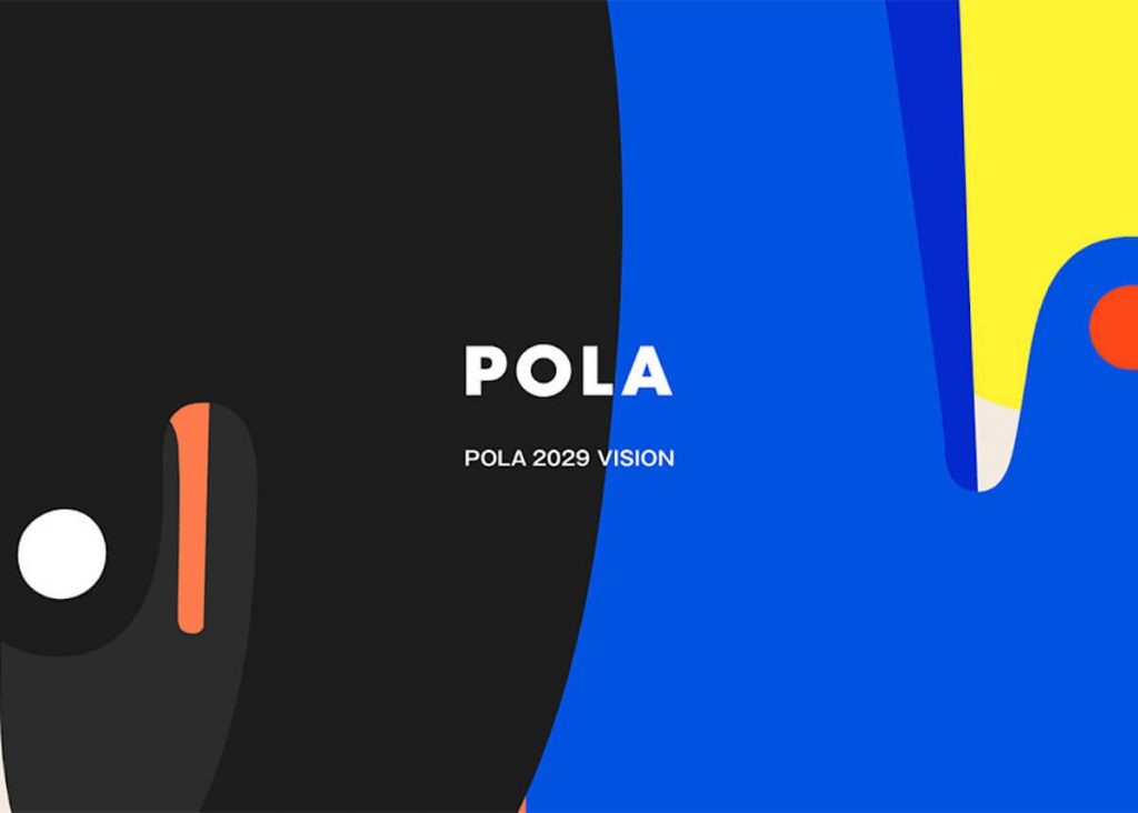
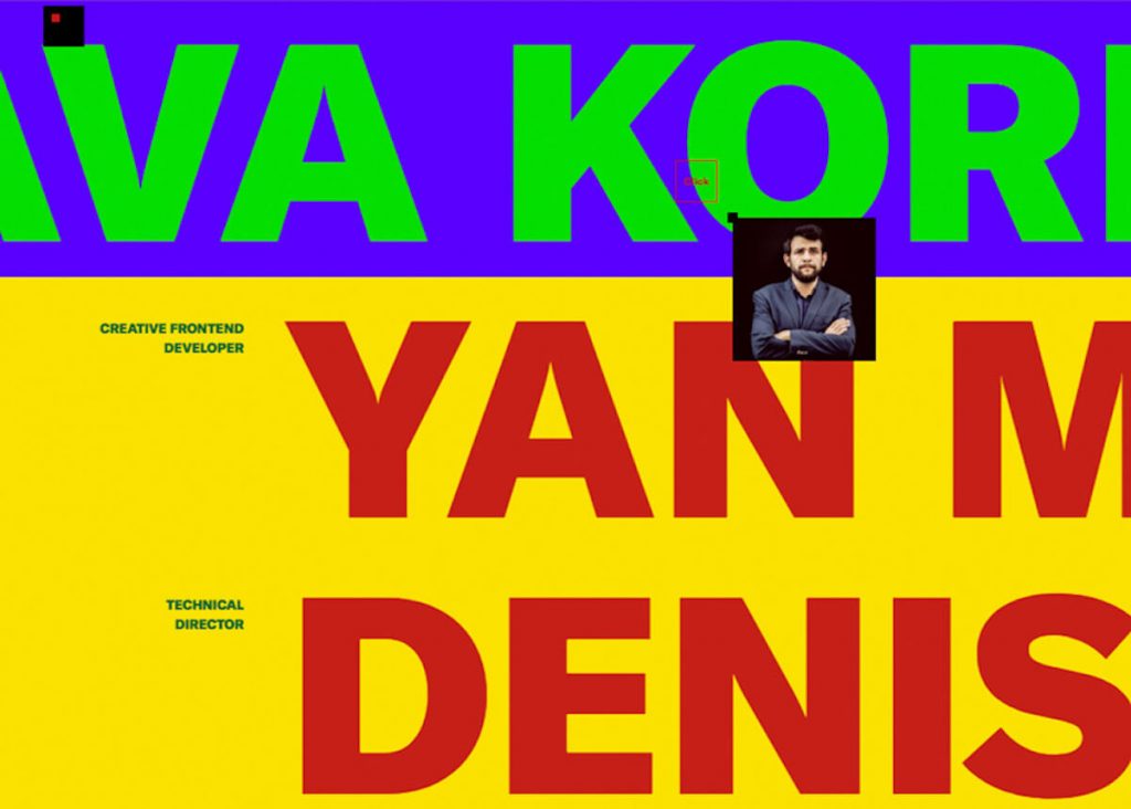
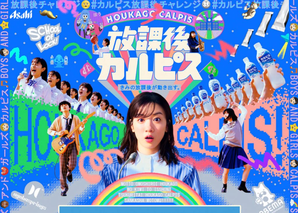
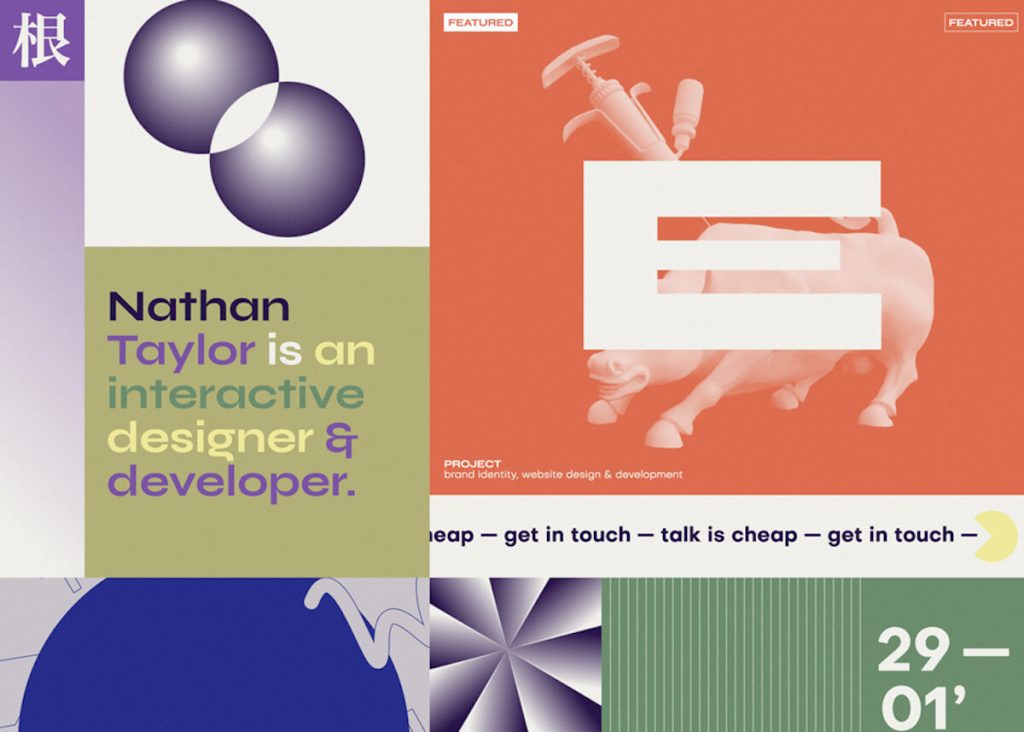
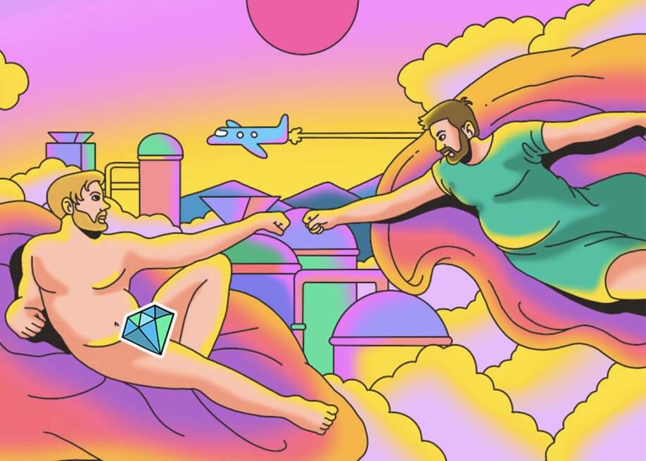
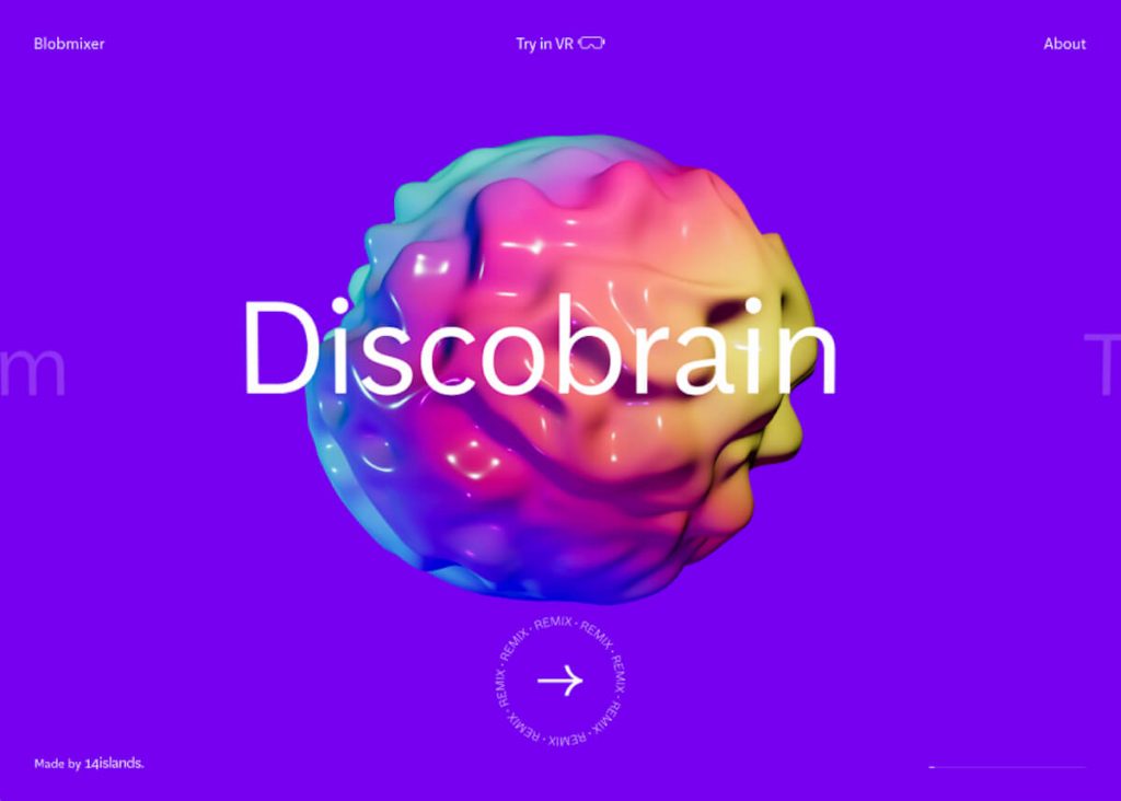
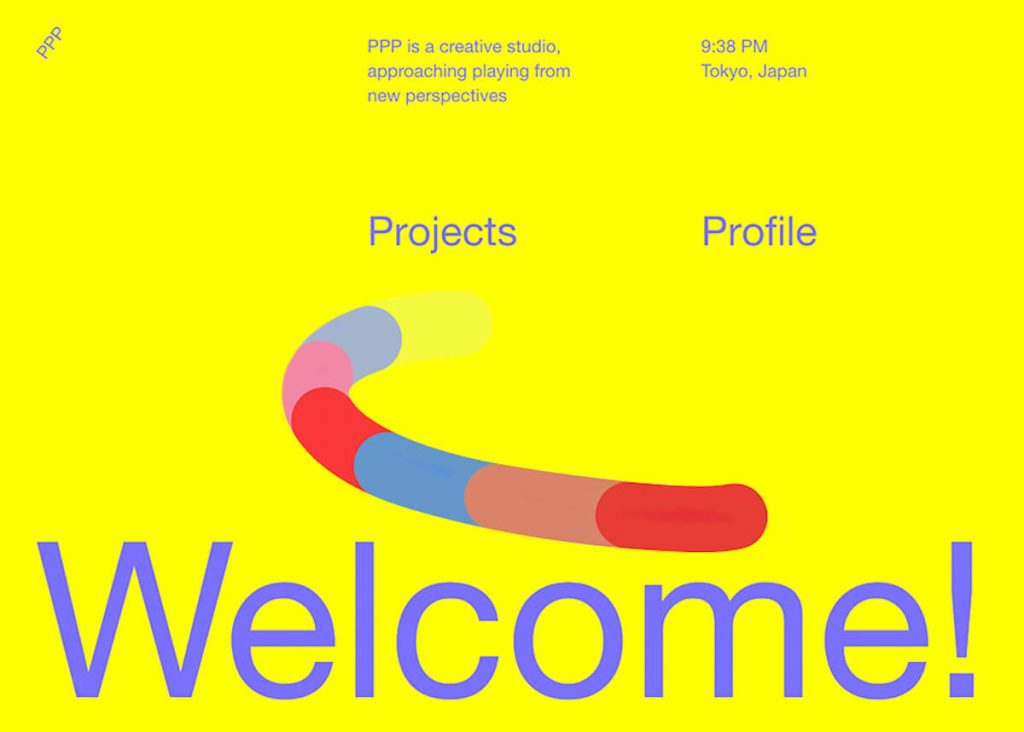
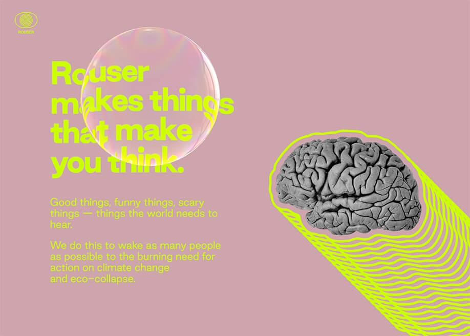
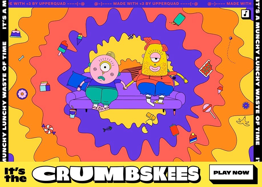
With a palette that does not restrict itself to one dominant colour, mass quantities of colour take over traditional white backgrounds. A strong contrast of vibrant complementary colours stands out, offering visual impact rather than seeking harmony.
There has been a progression of different contemporary graphic styles in a repeating cycle. It is a style that returns over and over again, varying from rational functionality to minimalistic expressions to more transgressive and explorative appearances.
Vibrant Colors Modulated by Neutrals
The age of ‘soft pastels’ has come to an end as we see the emergence of strikingly risky colours and pairs that are about striking an impact rather than harmony. It is about ranges of vivid colours of differing non-adjacent tones.

Next Level Fairs
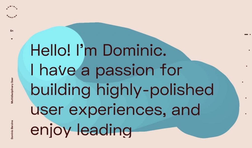
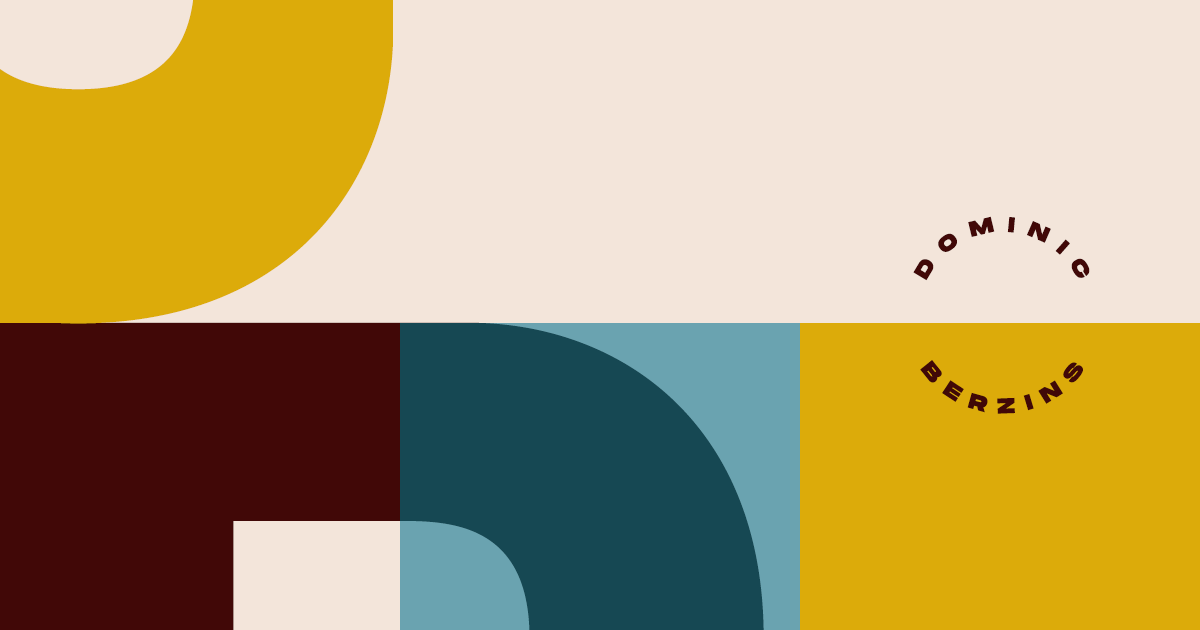
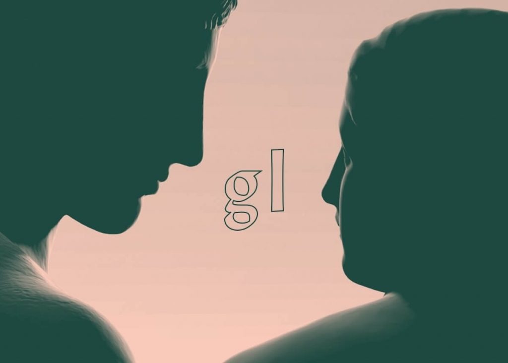
Dominic Berzins — Multidisciplinary Doer
It is generally recommended to soften these vibrant colours with muted or neutral colours, which aid in directing attention where it should be.
In addition to the use of solid colour areas, it is prevalent to find (as seen in the examples shown in the following) isolated notes of luminous colours that catch the eye.
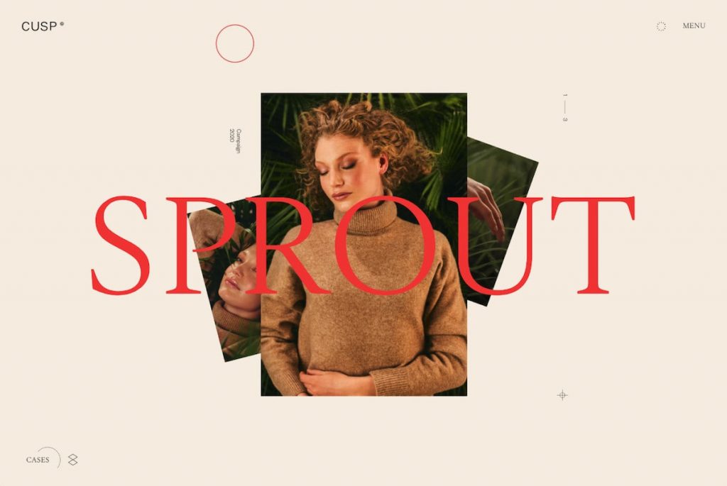
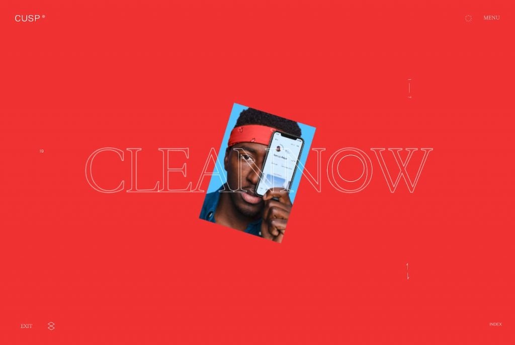
Home | CUSP
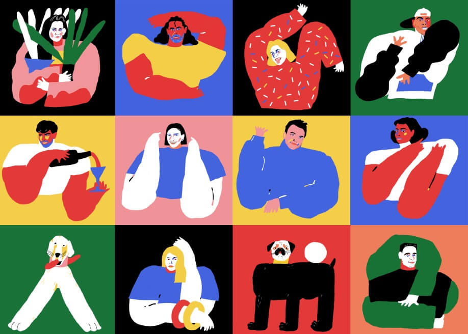
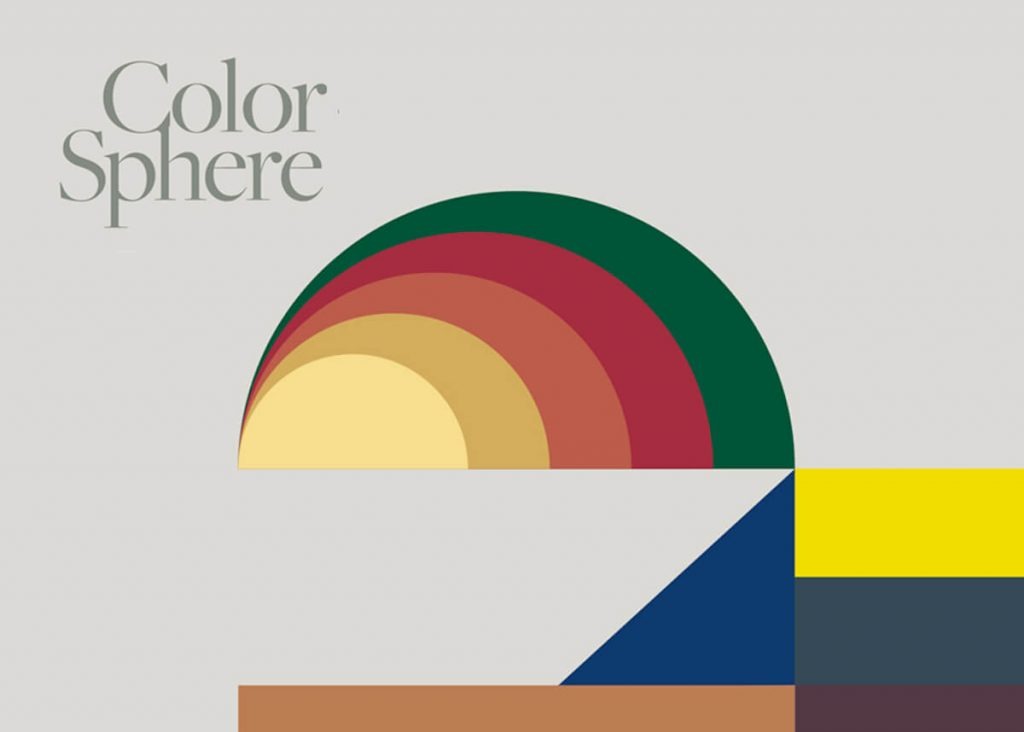
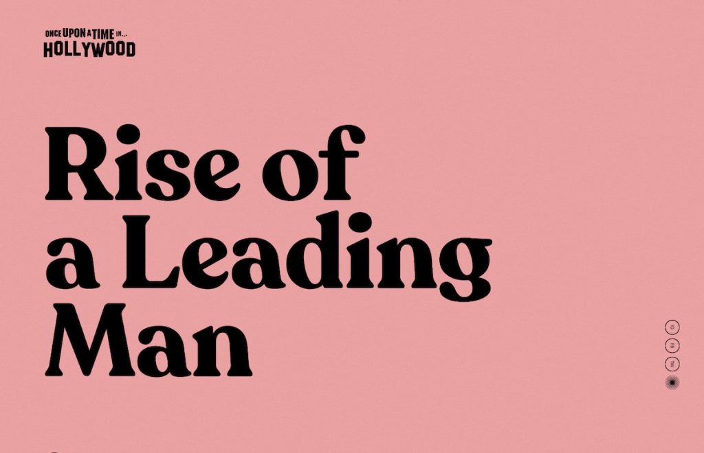
Color-Blocking & Big Solid-Colored Areas
Since the 1960s, fashion designers have used colour-blocking, which can be traced back to the work of Dutch artist Piet Mondrian. Bright and bold colours are combined with their complementary colours in an exploratory manner. It is unnecessary to place them precisely on opposite sides of the colour wheel for an exciting combination. However, it would help if you were looking for a strong contrast between solid areas of colour.
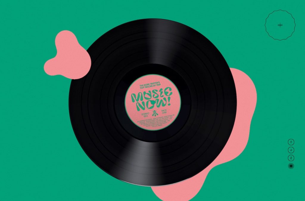
Next, we will see masses of colour unapologetically invading the background and organic abstract shapes while exploring the interaction between hue and shape. Geometries with subtle colours and imperfect shapes are reminiscent of the “Cut-Out” style of Mattisse.
www.onceuponatimemag.com
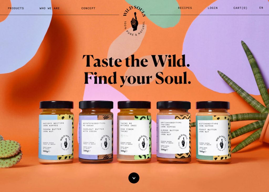
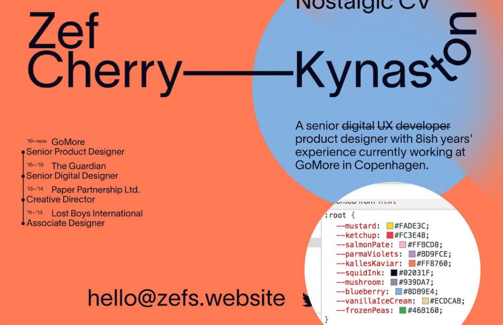
More Colors in the Palette
Colour palettes can be created and standardized to produce a consistent visual language across all media and represent any brand or product.
Palettes of colours used to be much more limited, consisting of just one or two dominant hues. The publication of elaborate design systems (like the new design for DropBox in 2017) has contributed to the trend of the importance of colour and pushed the palette even further than it used to be (typically the primary colour of the brand along with a highlight colour and a few neutrals).
Zef’s Website
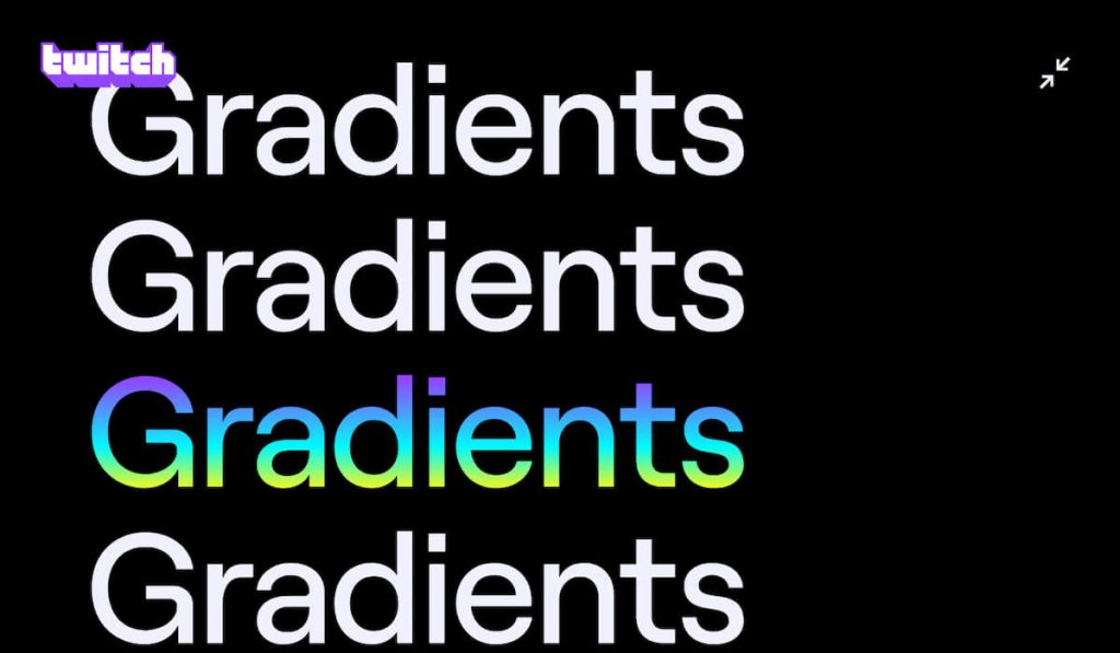
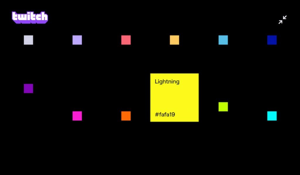
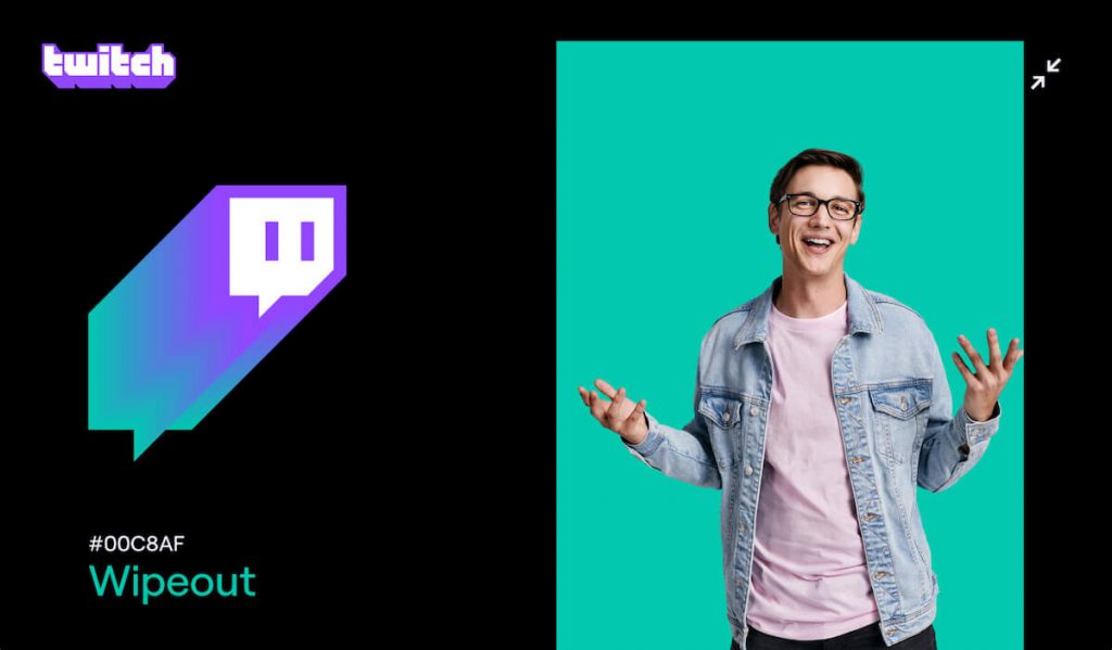
Twitch Rebranding with a New Expanded Palette
As well as refreshing the logo, Twitch has reinvented its typeface and expanded the colour palette to include vibrant shades and increase the vibrancy of the colour purple. In this palette, purple is the dominant colour. The colours blend to create duotone gradients, which mimic 3D extrusions.
Twitch Brand | Maxing our expression
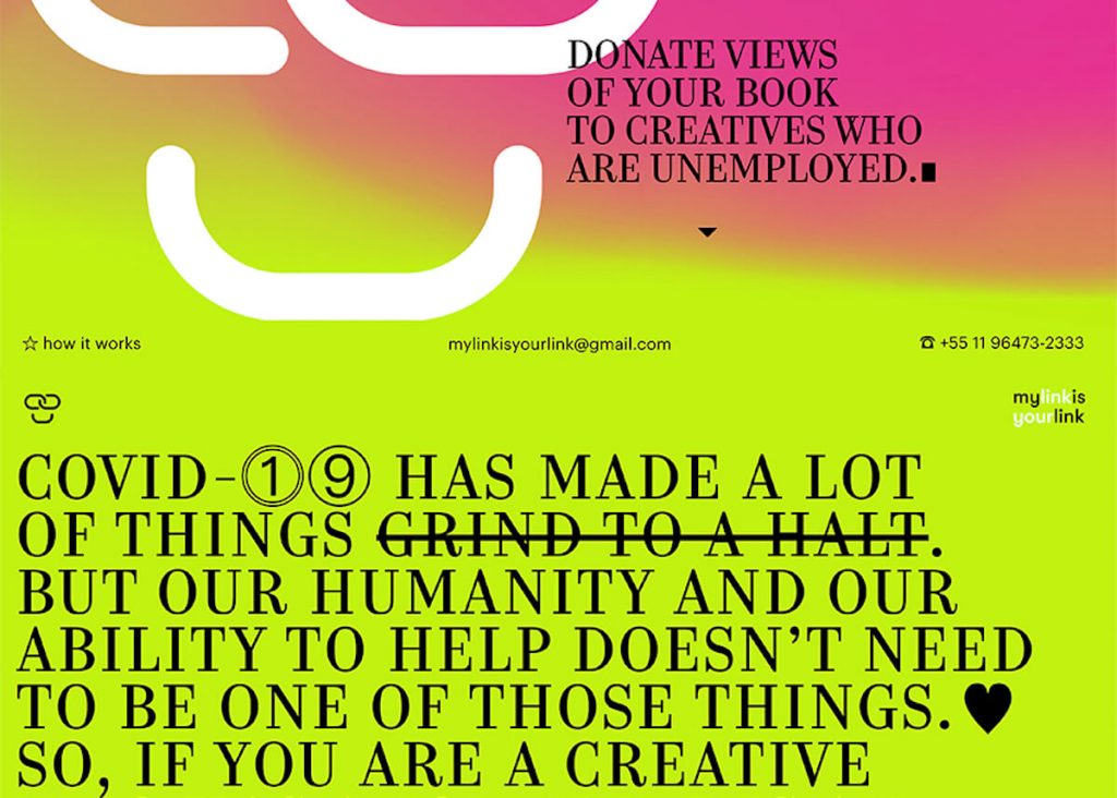
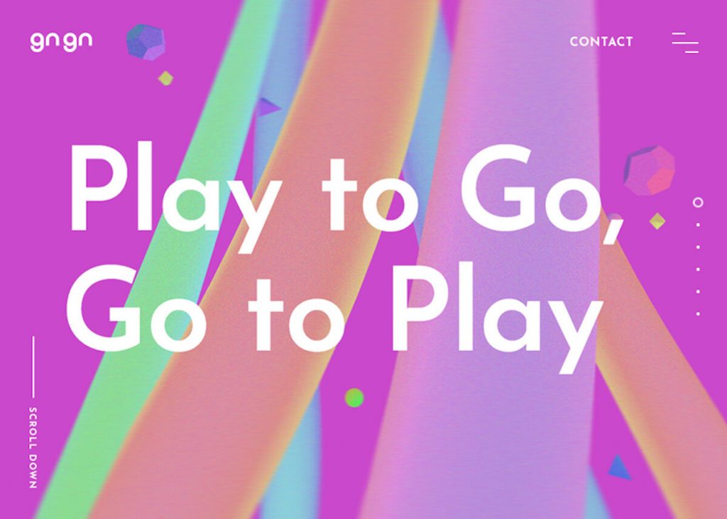
Multi-Coloured Backgrounds
Below are examples of chromatic sequences with scrolling backgrounds that advance along with the content displayed. The colour palette becomes more apparent through lengthy scrolling, and each one has a changing one-page layout. Compared to the background, the colour contrasts sharply with the contents.
Getting contrast with Typography
Type has become a graphic element that almost totally functions independently of the text’s communicative value, which provides a perfect contrast to colour. Animated backgrounds and texts alternate high contrast or complementary colours, which are accompanied by graceful animation sequences.

Vladimir Gruev | UI/UX Designer
Optimistic Pairings
Millennial Pink, which was at the top of the popularity list for soft pastels, is on the decline. The range of pastels started out with pinks dominating, and what we see in current fashion trends suggests that we might end up with loud colours.
Color experts from Pantone Color Institute state that the trend’s new color palette features colors in various combinations.
Combining our desire for stability, creativity, and more spontaneous design approaches, the color palette for Spring/Summer 2020 infuses heritage and tradition with a colorful, youthful update that creates strong multi-coloured combinations as well as energizing and optimistic pairings.
Leatrice Eiseman, Executive Director of the Pantone Color Institute.
Recently, web designers have been experimenting with hyper-saturated colors and weird, unattractive combinations that appear to go against the principle of visual comfort. Due to their saturation, high-contrast colors compete for the user’s attention, leading to a confusing user experience in terms of hierarchy, discoverability, and findability.
However, viewed from a more creative perspective, it can nevertheless be considered a unique and intriguing aesthetic experience.
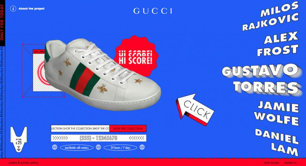
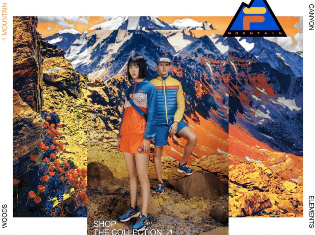
Optimistic Pairings in Color Palettes – 24hourace.Gucci, filaexplore.com